UX in e-commerce - how to effectively increase sales in online store
UX is an abbreviation for User Experience, and as the name implies it refers to the experience of users who visit our online store. The goal of UX in e-commerce is to create such a project that positively influences the interaction between users and the offer presented in our online store. This means that the online store should be easy to use and provide fast and comfortable online shopping. UX explores and analyses users behaviour and uses collected information to design user friendly interfaces that provide proper comfort of using our online store or application.
UX in e-commerce
UX is extremely important for e-commerce because this is the users’ impressions that decide if they would purchase a product or not and if they would come back to our store in the future. From the very beginning it is worth considering the whole project from the UX point of view. One of the key elements that influence online store UX is its design. Aesthetic and readable graphic design catches users attention and encourages them to shop online. It is also good to remember about responsiveness which is adjusting the website to different screen sizes. Another crucial thing is navigation of online store highlighting the short order path. The easier it is to do the shopping the less chance that the customer will resign. Next essential element is useful functionalities in the online store. Customers will be more willing to shop online if they can use fast payment methods or popular delivery companies.
UX is a widely understood term. Below we have prepared a few of the most important UX practices that can positively affect customer experience and what follows to improve sales in the online store.
1. First impression
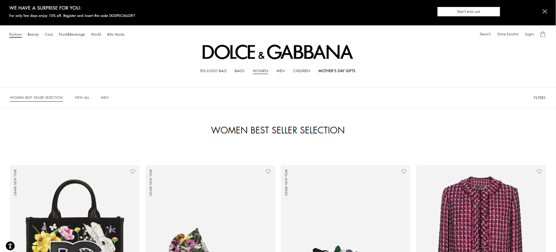
Users decide within just a few seconds whether they want to stay in the online store or leave it. What’s essential is that almost 60% of users don’t scroll through our website and see only the content that shows after the website loads. This is why the content in above the fold section is fundamental. It is the section that is visible right after opening the website, before scrolling down or visiting different tabs. It is good to place key information there, which may be interesting for the user (so called value information). This can be current special offers, bestsellers, list of product categories or additional facilities such as free shipping and returns, etc. All additional information or social proof sections (testimonials, business partners logo, etc.) should be placed below, according to their priority. The lower the content is placed the less chance that the user will see it.
Above the fold section should also contain call to action buttons, encouraging users to delve into the offer of our online store. This advice is valid both for desktop and mobile versions. Below we present the above the fold section in Dolce&Gabbana online store.
2. Navigation (main menu)
Simple navigation through the online store can help users to quickly find what they need. The basic way to facilitate the navigation through products is creating an easily available and noticeable menu (usually placed at the top of the website or on the sides. The menu should have clearly identified product categories and coherent division into categories. It is best if there are no more than 7 categories to choose from in the main menu. Take into account that some products may belong to more than one category. Think in what categories the user may search for a particular product, to not omit any of them. Users will rather leave the store than search for a product in various categories. This is the example of the main menu in Adidas online store.
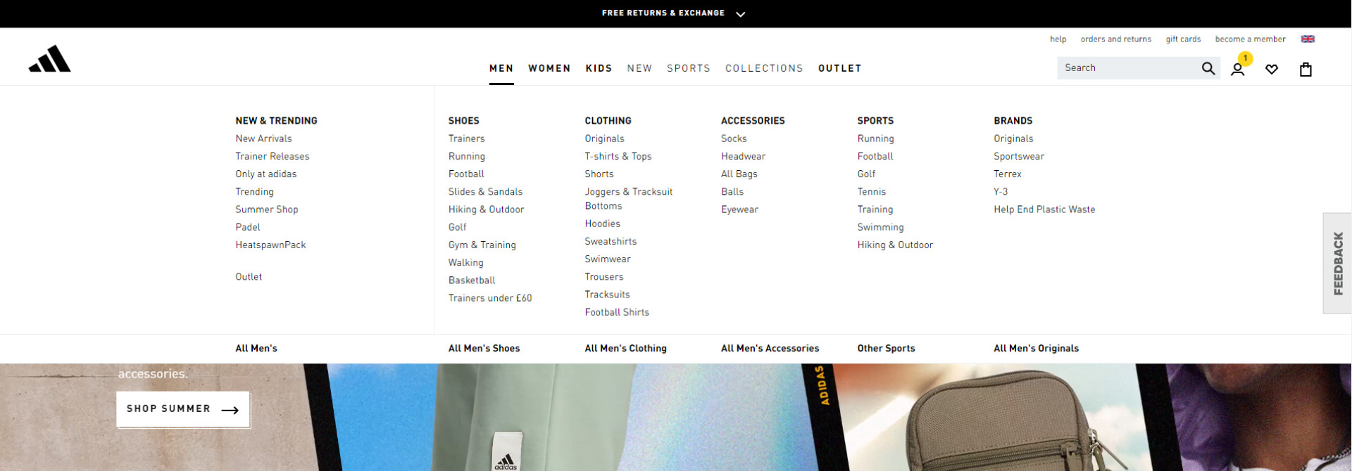
Main menu is also a section to place icons directing to the essential pages in our store, such as a cart, wishlist or customer’s account. Whereas cart or heart icon is well-known, any other icons should be marked, so that the users know exactly when they will be directed by clicking on them.
Main menu should also contain a product browser, information about language versions and locations of stationary stores (if we have them).
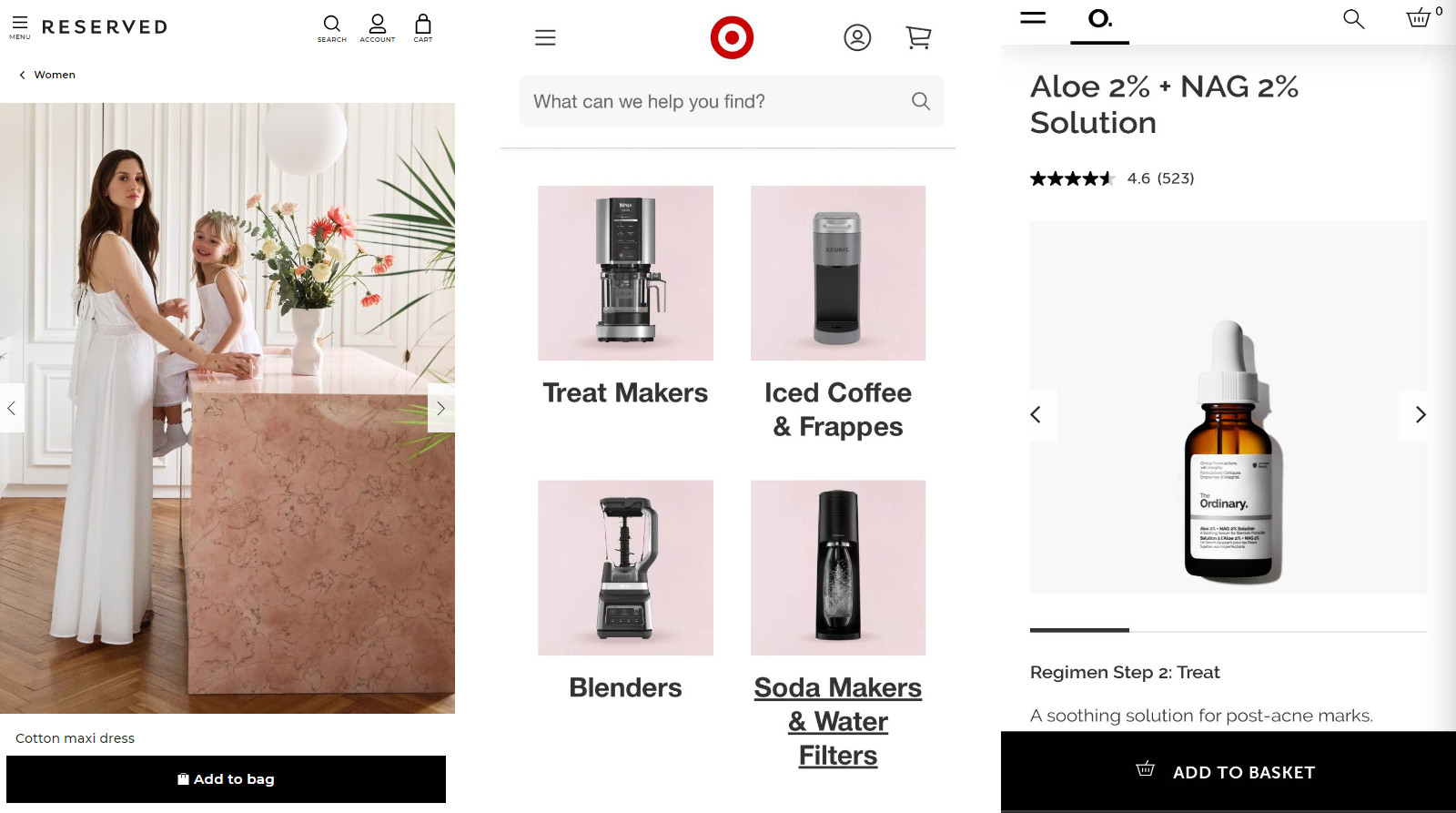
Another useful facility, especially on mobile devices, will be a floating menu, which stays on the screen while scrolling through the online store. In addition we can think about adding some options at the bottom of the screen. Thanks to this the user can choose a particular option just by operating the thumb. We can see the examples of such solutions in online stores like Reserved, Target or The Ordinary.
3. Product browser
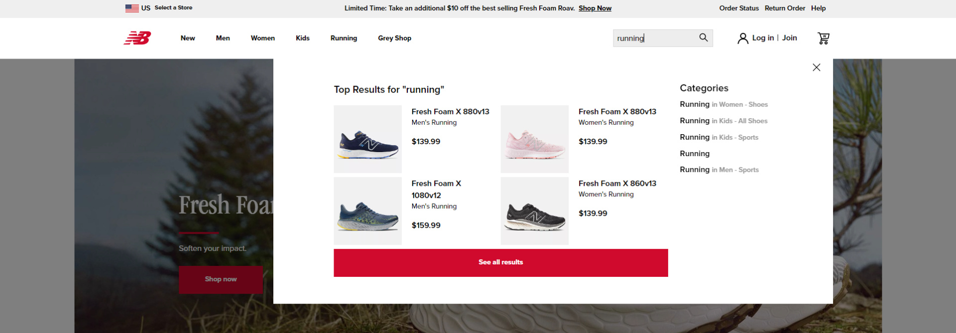
Product browser is a convenient option for those who search for a particular product. Depending on characteristics of the industry and the online store, the browser should search for the products by various criteria - the most often it is a name of the product or category, product’s code or ID.What’s more you can think about filtering search results, which will additionally facilitate fast and efficient search. another additional option that the browser may have is automatic suggestion of products while typing. The browser should also correct the most common spelling mistakes. Below you can see the browser in New Balance online store.
4. List of products
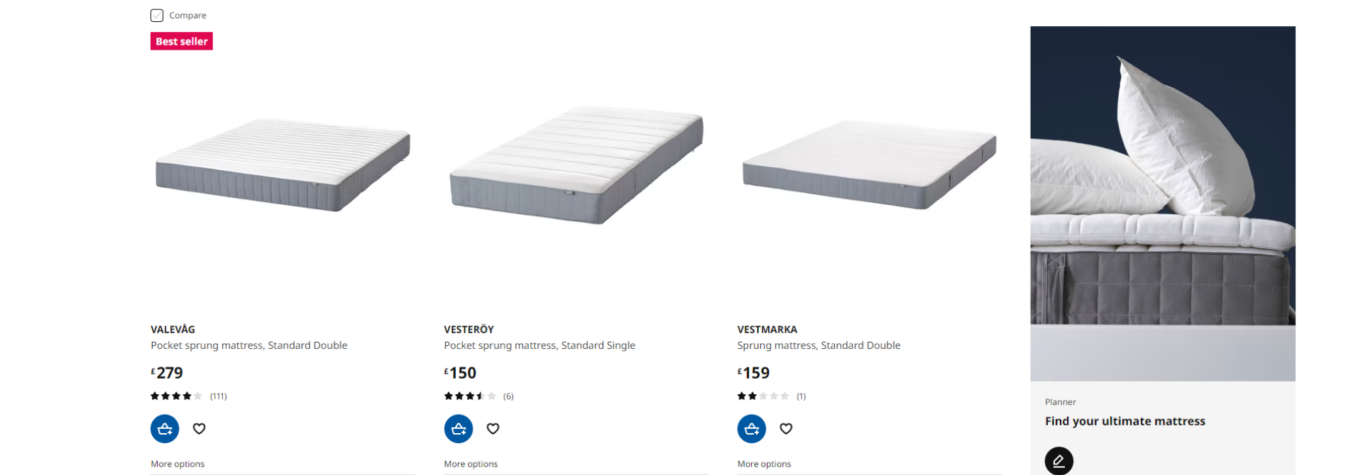
Online stores are visited by users who know exactly what they want to buy and who haven’t decided yet what they want. Some of them don’t want to buy anything at all and just want to look through the products. However, each of them wants to see products as fast as possible. To improve browsing the products it is good to add the possibility of filtering and sorting the products. The product list should also have information about the number of items and pages that it contains. A useful addition to the product list is an option for quick adding to basket, wishlist or comparer. These elements enable easy and fast shopping, even without the necessity of entering a product page. This is especially useful in wholesale or periodic shopping. Below graphic presents the product list in IKEA online store.
Remember that the list of products should predominantly interest users with presented products. Don’t put SEO content above the list of the product. You can place the block of the text describing your offer or category below the list of products and pages numbering.
5. Product page
Product page should of course present the most relevant information about the product. For sure a key element is the product's picture and gallery. It is obvious that pictures have to be of proper quality. Users also want to see products in different variations and arrangements. If we have such a possibility we should add more than one picture of the product. The basic facility for users is zoom thanks to which they can enlarge pictures and see every detail. More advanced solutions are a 3D picture that allows for 360 degree rotation and seeing the product from each side or a video presenting the product. We present an example of product page in O2 online store.
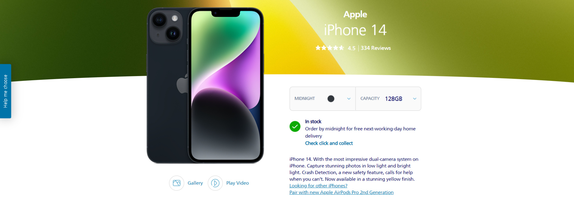
Next to the picture of a product we should place the fundamental information about it - the name, price, stock number, available variants and short description. All of the additional information should be placed in the section below, so that they don’t interrupt users attention. The bottom part of the product page is also a great place for placing cross sell and up sell products, encouraging users for further shopping. The positive influence on shopping online has also testimonials left by users who have already bought the product. Testimonials increase credibility of the online store and what follows trust of users.
6. Footer
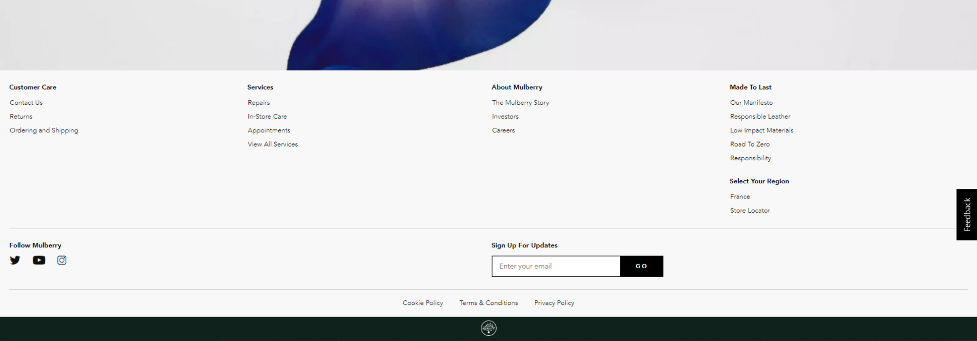
A footer usually contains contact information and direction to the most essential pages for users. If customers want to contact customer service, find a return form or your social media, that’s the place when they will look for it. It is a good idea to add crucial elements of our offer. If customers scrolled the whole page, the footer is the last element they would see. So if they haven’t found yet what they are looking for this is the last chance to direct them to key elements of our offer. Remember that it is necessary to keep the footer minimalistic. Don’t add to many links and don’t overload the footer with content. Highlight particular sections with bolding, font sizes and colours. This is an example of a footer in Mulberry online store.
7. Communication
Customers who want to ask a question or have a problem with their order want to receive the answer immediately. When customers send a query it means that they are actually interested in the offer. If they wait a few hours for the response they may lose the willingness to shop or choose a different offer. If that is possible propose other forms of contact, such as phone number or live chat. However, remember that in case of phone calls or chat there is no place for delayed answers. The faster you contact the customer the better.
8. Cart
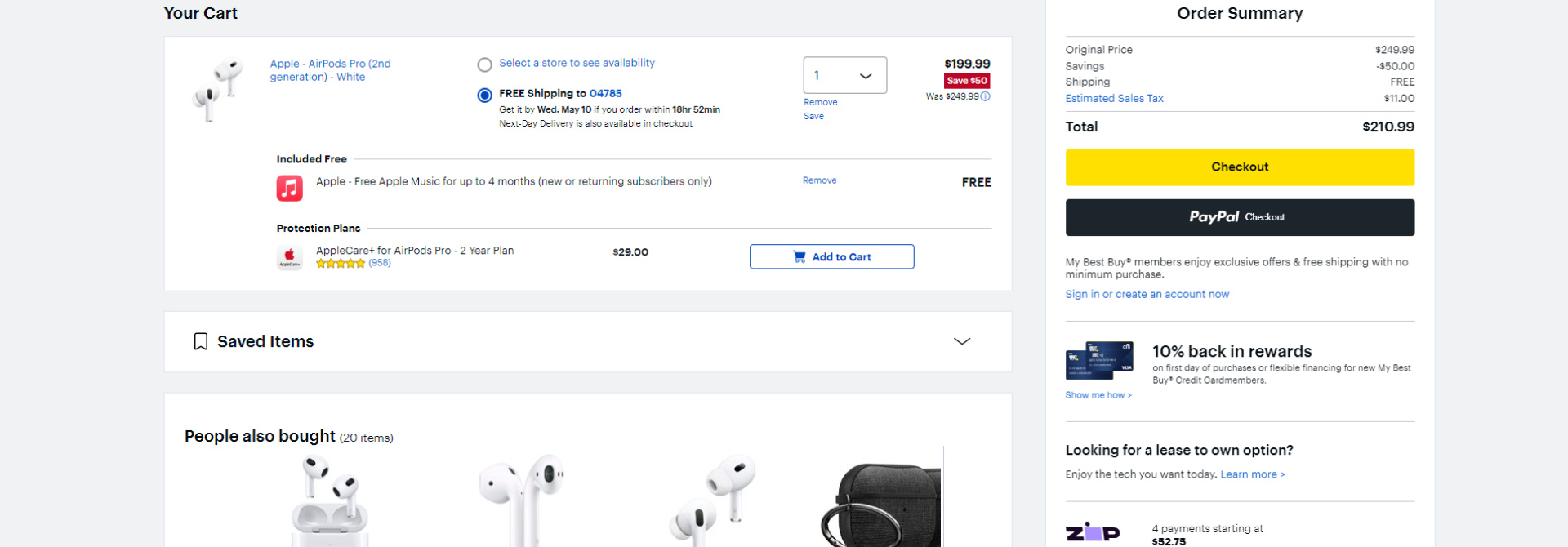
A cart page has a substantial function in the online store. Many customers decide there which products they will buy and which drop out. At the cart stage we often check if we didn’t make any mistakes while shopping. We want to verify if we have chosen the correct size, colour and amount. This information should be easily noticeable. The cart is also the last section in which we can encourage customers to shop further, complete the set or buy some accessories. Sections like ‘Products you may like’ or ‘People also bought’ may help you with it. If you offer free shipment from a given amount you should add information about how much is left to receive it. Below we present the cart in Best Buy online store.
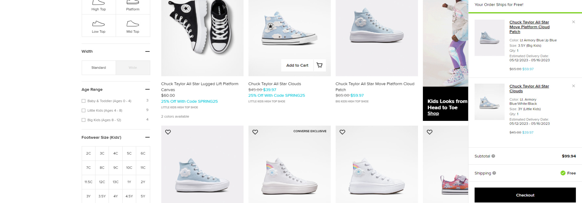
Apart from the cart page you should also remember about the cart miniature that should be placed in the right top corner of the screen. The miniature should not only show the number of items in the cart but also open a widget, where customers can check added products without going to the cart page. However, the widget itself won’t replace the cart page. It is only the addition facilitating shopping, where customers often look to check for instance total amount or if they have added all of needed products. The widget should have direction to the cart page (alternatively to the checkout page, which will make the order path even shorter). This is the presentation of the cart widget in Converse online store.
9. Checkout
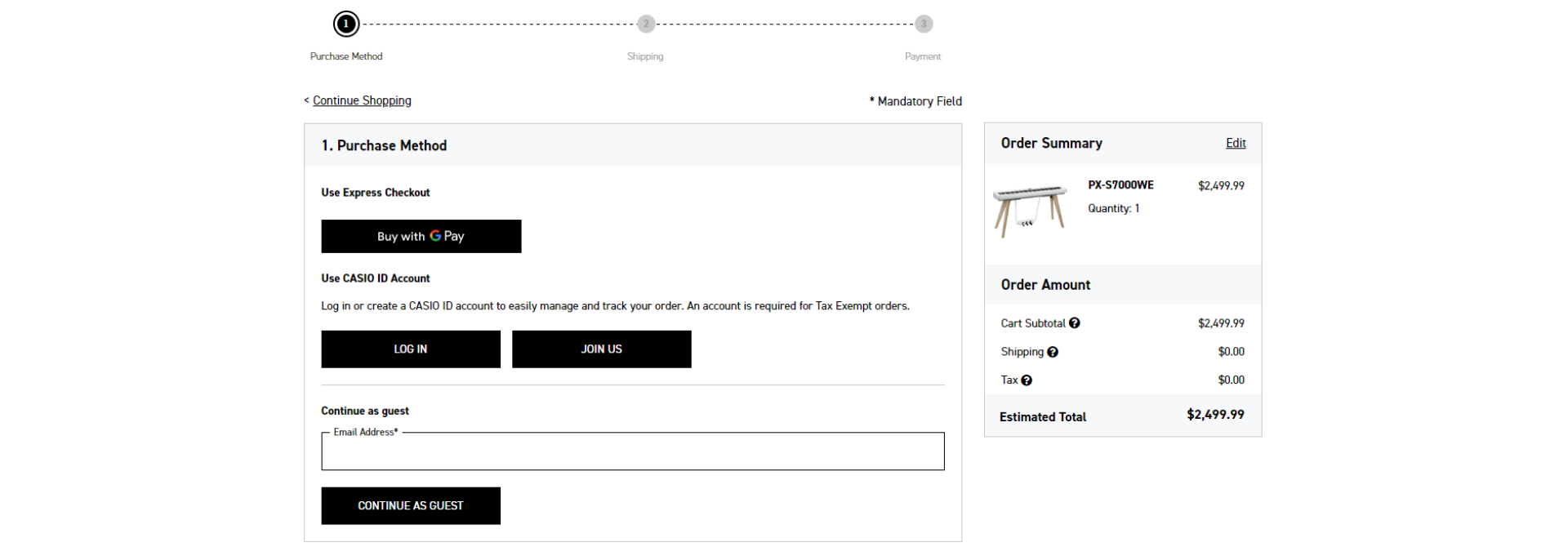
Going into online store checkout usually means the will to finalise the order by customer. However, completing personal data is not customers’ favourite activity and if we won’t simplify it, there is still a chance that users will abandon their orders. First of all the data form should be as short as possible and require only must-have data for payment and shipment. Secondly, it is a good thing to add a progress path that informs what steps are left to complete the order, for example Account Information, Shipment, Payment. We shouldn’t add additional elements like banners or recommended products. Another good idea is to hide the menu to not distract users with additional options. In this case users can still leave the checkout (for example by clicking on the logo), but focus their attention on the form they have to fill. This is the checkout of Casio online store.
10. Registration in online store
The majority of customers associate registration with loss of time during online shopping. Users have to type more data, create unique login and password that they have to memorise. On the other hand, registration in the online store is very important for further marketing activities. You shouldn’t force customers to register in your online store, but you should definitely encourage them to create the account. To do it you can think about additional amenities for registered users, such as discounts for the first shopping, collecting points in loyalty programs or possibility of tracking shipment. More and more online stores are adding the option of registration via Google or Facebook - this is a fast way of registration that is often used by customers.
11. Order confirmation
After placing the order it is good to thank customers for purchasing products in your online store. The confirmation of the transaction is also valuable information for the customer that their order was successful and was handed over to realisation.
12. User Experience offline
Another thing that decides if the customer will come back to our online store is offline user experience. These are a number of actions that happen after placing the order, including fast realisation, fast shipment, proper and nice packaging and eventually the product itself. A nice gesture that will be for sure memorised by customers will be adding some small gift or thank-you card. Next useful thing for a customer will be a return form or clear information where customers can find one. Efficient customer service and claims will also transfer to the positive user experience. When we see that the customers have received the order, we can ask for their opinion about our online store, so we have direct information right from our target group.
