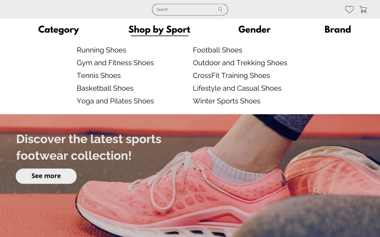
Intuitive navigation in your online store - let users quickly find what they're looking for!
Navigation in an online store is a key element that directly impacts user experience and therefore conversion, meaning the actions a user takes in the online store. Customers want to find the products they’re interested in quickly and easily. If they don’t know how to navigate the store or which path to follow, they’ll quickly leave the site without making a purchase. In this article, we’ll show you a few simple tricks to improve navigation in your store, allowing customers to move through it freely and seamlessly.
1. Multiple paths to the same goal – Adapting navigation to user needs
The menu is the backbone of navigation in every online store. A clear division of products into categories prevents customers from feeling lost and helps them find what they’re interested in more quickly. However, a category name alone might not always match the customer's exact thoughts when shopping. For instance, a user might be looking for women’s running sneakers. By creating a menu that lets users find a product in multiple ways, you increase the chances that they’ll find exactly what they’re looking for.
Here are some pathways that can lead users to their goal:
- Product Categories
- Purpose
- Target Audience
- Brand
Some customers may not have specific requirements and simply look for "sport shoes." This general category offers a broad selection of models for various activities, which is useful for those who want to browse the available options in your store.
This is an ideal solution for those looking for shoes for a specific purpose, such as running shoes or gym shoes. This kind of division suggests which products best suit the user's needs.
Navigation organised by the target group is another way to simplify shopping. Many stores use categories like ‘Women’s Shoes’, ‘Men’s Shoes’, or ‘Kids’ Shoes’, allowing customers to go straight to the section that best meets their aesthetic and technical needs (e.g. size, design).
If your online store offers products from several brands, this is a great criterion for users searching for trusted, well-known products from a specific brand. Others may want to find a popular model a brand offers.

This type of structure makes shopping more intuitive, allowing customers to skip over models that aren’t suited for them. Try adjusting the above pathways to match the assortment in your online store.
2. Filtering and sorting – essential for tailoring search results to the user
In addition to categories, product filtering is essential. The ability to filter products by size, price, colour or user rating is a real time-saver for shoppers, allowing them to adjust the offering to their preferences. Filtering should include key attributes of the products, typically colour, size and price range.
Sorting is another indispensable feature in an online store. Most users sort product listings by price, popularity and rating.
3. Search Bar – let users find their target product in seconds
Some customers go straight to the search bar to enter specific terms like ‘black gym shoes’ or ‘women's athletic shoes’. That’s why the search bar must be efficient and intuitive. Ideally, it should suggest search terms, understand user input even with typos and display results that match what customers want. Of course, search results should offer filtering and sorting options. This functionality makes it easy for customers to find exactly what they’re looking for in your online store.
4. Breadcrumbs – Following the path
Breadcrumbs show the path a user has taken to reach a specific page, e.g., Home > Women’s Shoes > Athletic Shoes > Gym Shoes. Although often associated with SEO, breadcrumbs are also important for navigation, enabling users to quickly return to previous categories. With breadcrumbs, users always know the steps they took to reach a particular page and can easily go back to previous categories.
5. Personalisation – show that you remember their choices
A highly valued feature by users is the store’s ability to remember their choices. More advanced personalisation often relies on marketing automation and is invaluable for tailoring offers to the user’s preferences. These tools require a significant amount of traffic in the online store, but even on a smaller scale, a function showing recently viewed products during the current session can be beneficial. This gives the user a quick overview of products they’ve already viewed during their visit.
Intuitive navigation is the key to a successful shopping experience in an online store. By offering various navigation paths, you spare users from excessive thinking, making it much easier to navigate the site. This, in turn, makes shopping more enjoyable and intuitive. The simpler and more well-thought-out the navigation paths, the more likely users are to find the products they’re looking for quickly and return for more.

